
(PRE-LAUNCH) Copy forward promotional site – marketing



Abstract
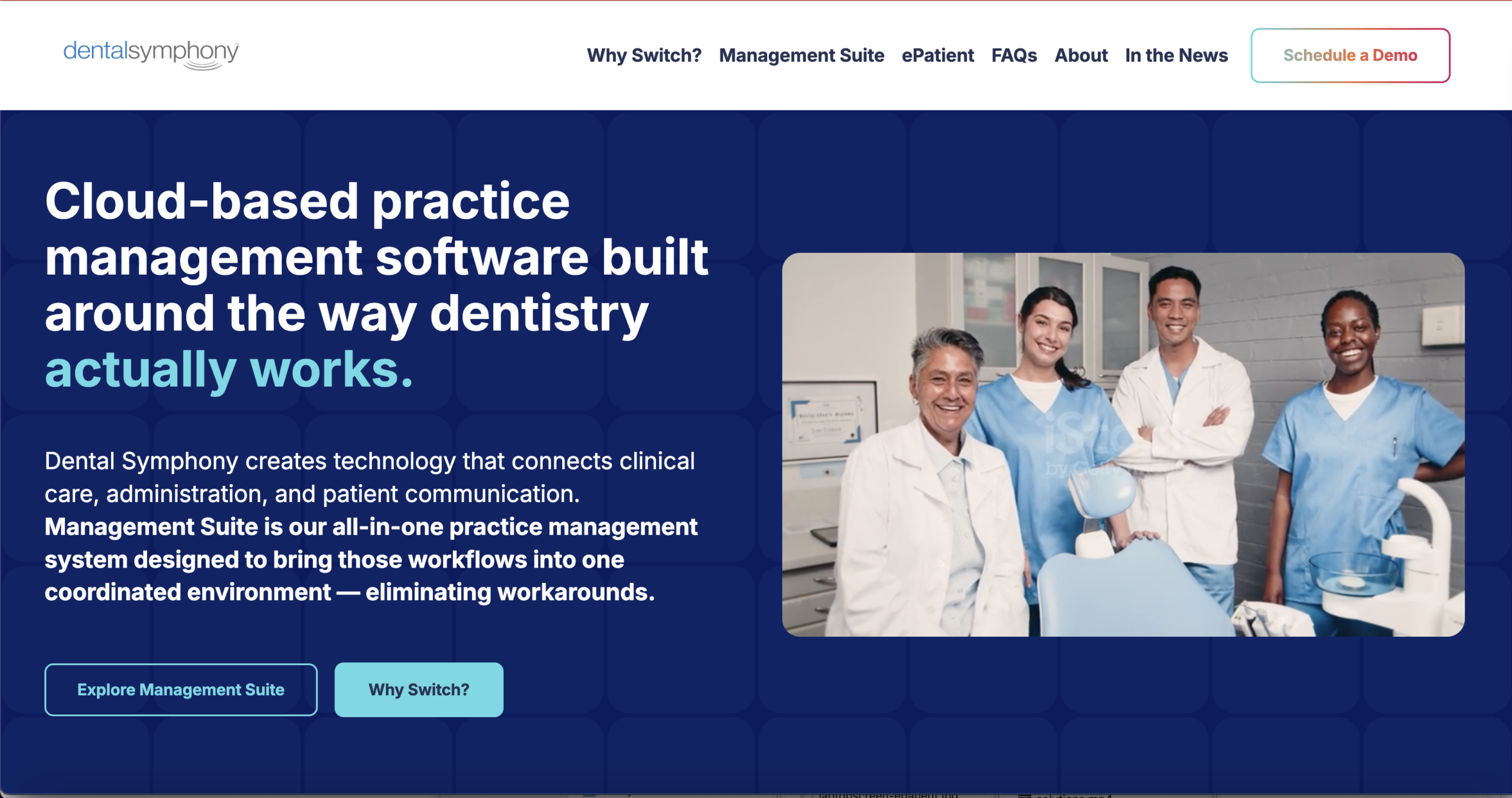
The Dental Symphony website was designed and developed to transform a complex, information-heavy software offering into a clear and approachable digital experience.
The project combined UX strategy, visual design, content restructuring, WordPress API development, and custom Gutenberg blocks to create a responsive marketing platform that explains the software without overwhelming prospective customers.
A key part of the strategy was reducing extensive copy to concise, focused statements, organizing related concepts visually, and creating clear pathways that consistently guide visitors toward the site’s primary conversion goal: scheduling a demo.
Problem
Dental Symphony offers a robust software platform with a large number of features and concepts to communicate. The original content reflected that complexity, resulting in pages with substantial amounts of copy that risked overwhelming visitors before they understood the product’s value.
The challenge was not simply to redesign the information—it was to simplify how the product was explained.
The site needed to:
- Make a complex software product easier to understand
- Reduce cognitive overload without losing important messaging
- Organize related concepts into recognizable groups
- Help users navigate long, information-rich pages
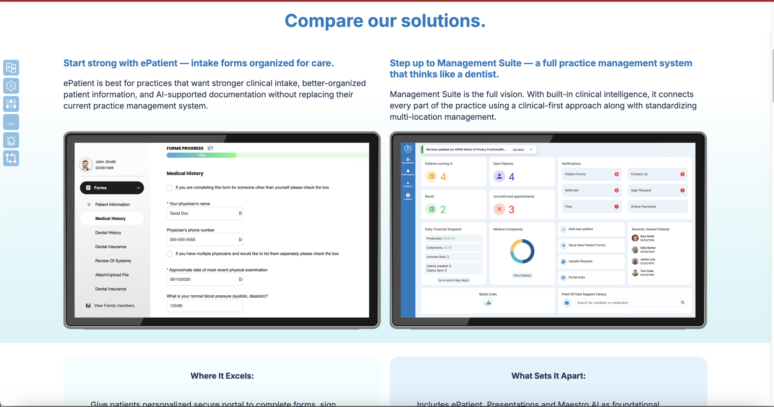
- Visually connect the marketing website to the software itself
- Consistently move prospective customers toward scheduling a demo
Design Goals
Reduce dense copy to the most important ideas, often communicating a concept in a single focused sentence.
Make it immediately clear when users are moving between different topics and product concepts.
Give visitors control over how deeply they explore the product.
Introduce visual patterns from the Dental Symphony software so the marketing experience feels connected to the product.
Ensure every page provides a clear path toward scheduling a demo.
Concept Development
The central design idea was progressive simplification.
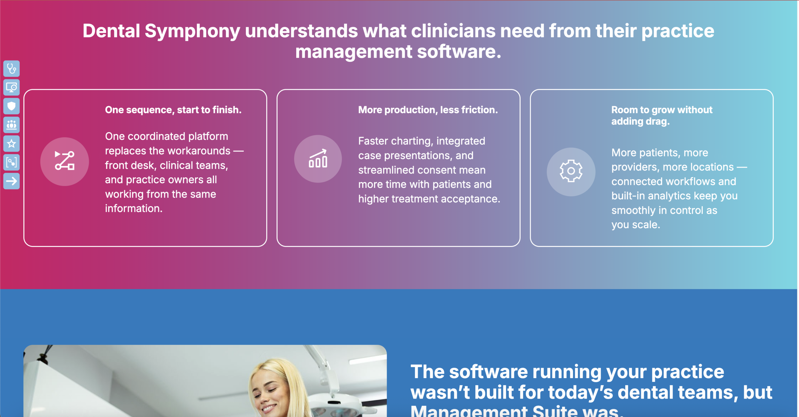
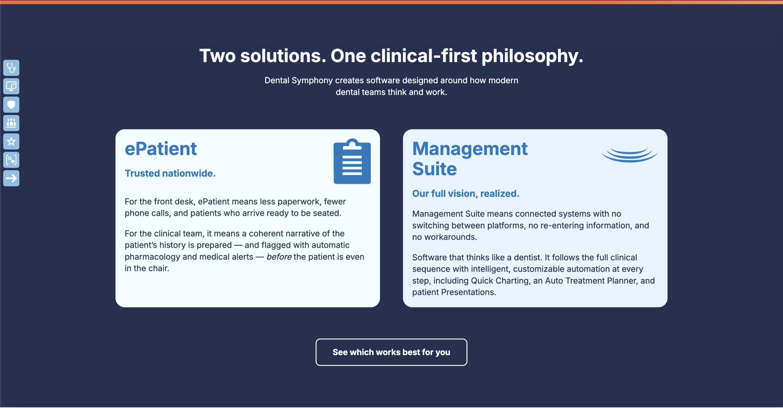
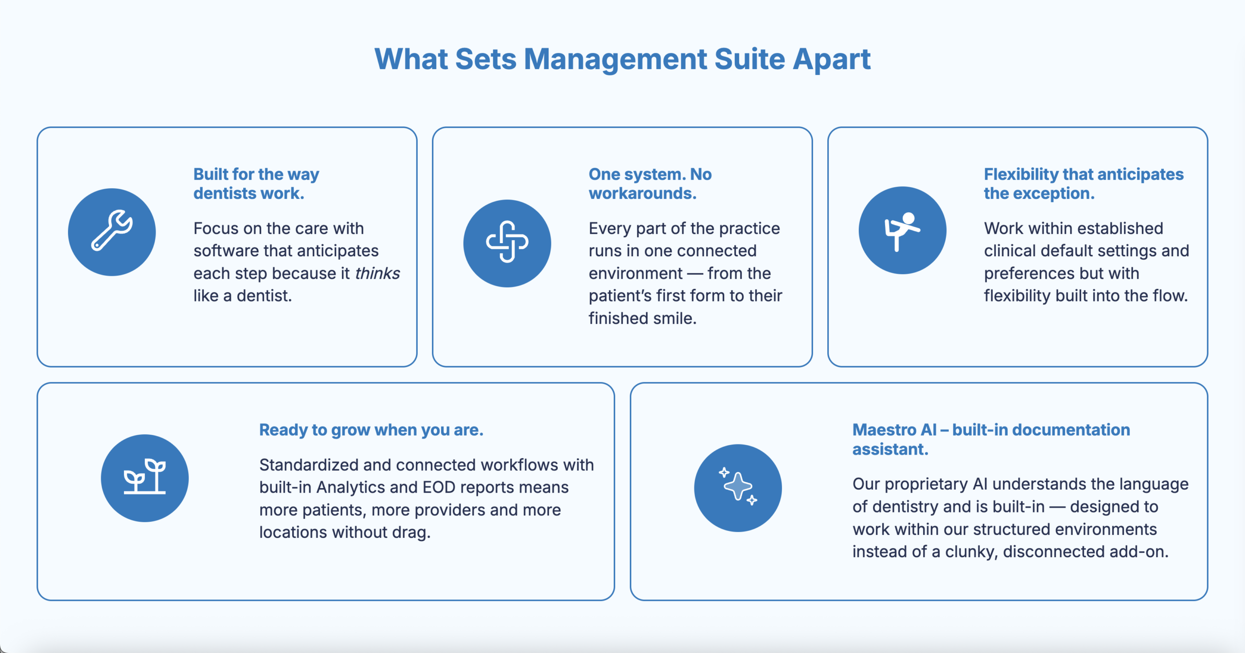
Rather than presenting every detail simultaneously, content was reduced and reorganized around the concepts prospective customers needed to understand first. Related information was then grouped into distinct color-coded sections, creating visual boundaries between topics.
This allows visitors to quickly recognize: new color > new section > new idea.
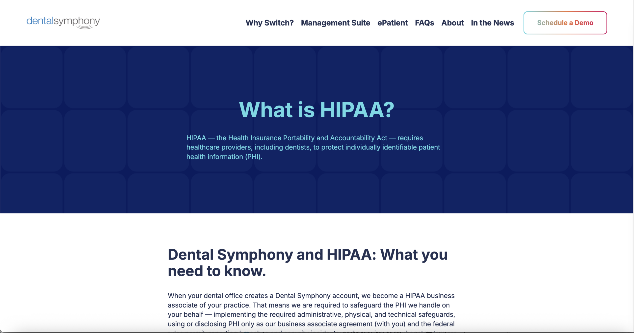
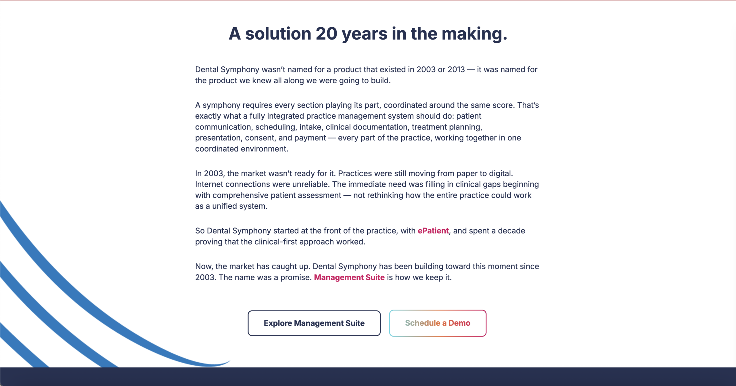
The visual system extends beyond color. Background motifs reference the Dental Symphony logo and incorporate shapes found within the software interface, creating a visual connection between the website and the product.
Animated SVG illustrations add movement and personality to otherwise text-focused pages, providing visual pauses between informational sections without distracting from the content.
Experience Design
Reducing Cognitive Load
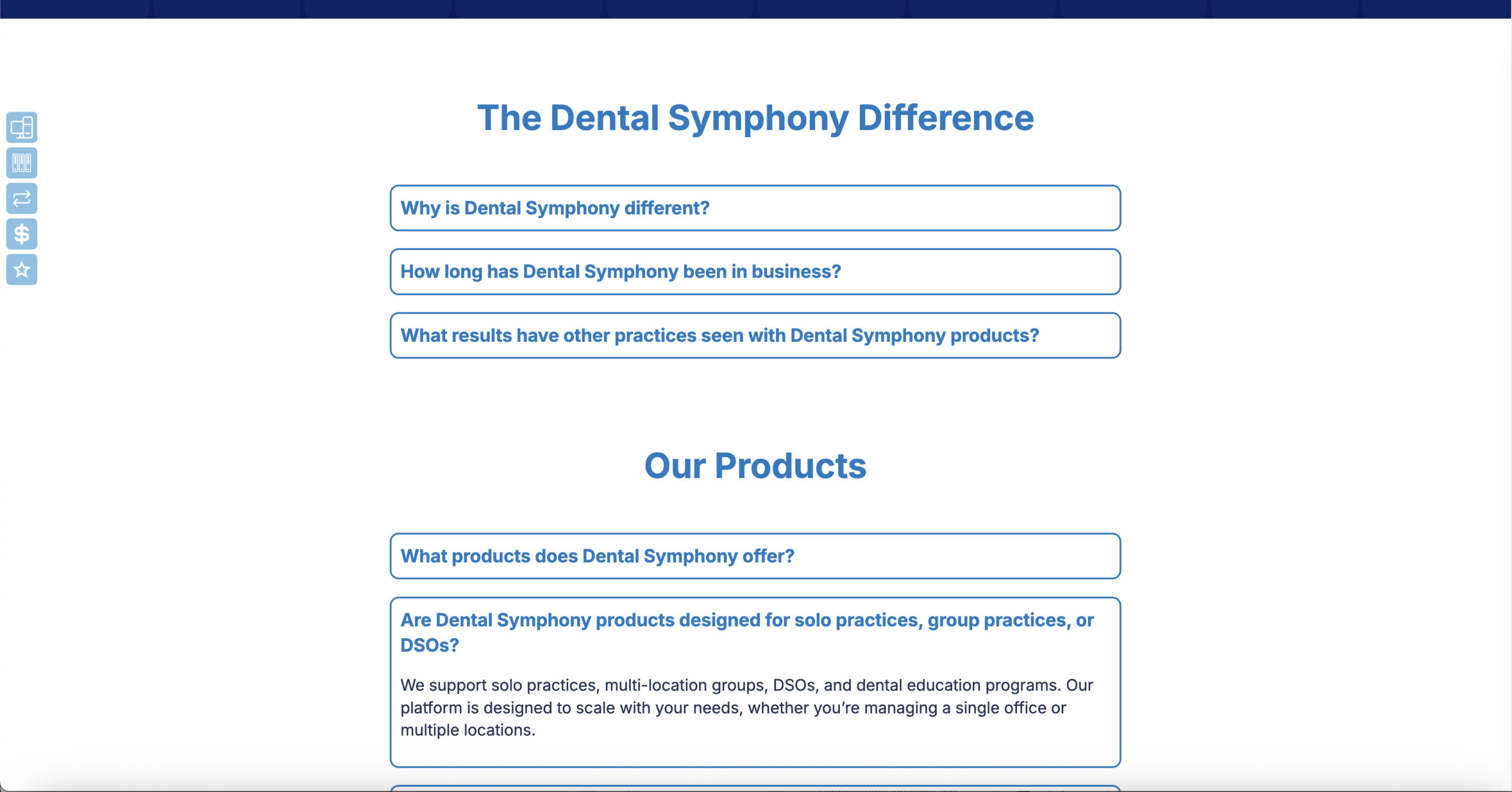
One of the most significant UX decisions was reducing the original volume of copy.
Instead of expecting visitors to read lengthy explanations, each major concept was distilled into concise messaging supported by strong headings, imagery, animation, and deliberate whitespace.
This transformed dense product information into a page that can be scanned first and explored more deeply when desired.
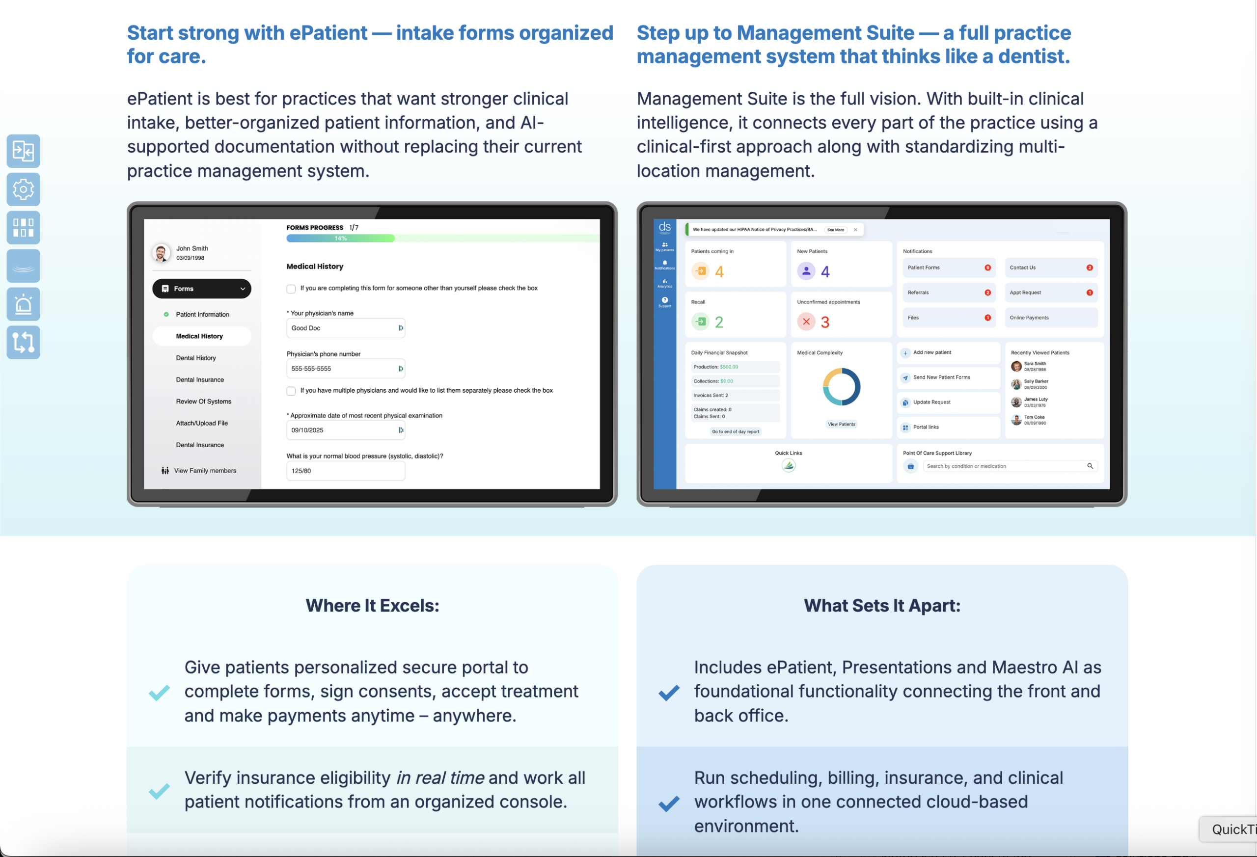
Color as Navigation
Color serves a functional purpose rather than simply decoration.
Related concepts are grouped into visually distinct sections so visitors can recognize changes in subject matter before reading the content itself.
The result creates rhythm across longer pages and prevents large amounts of information from blending into a continuous wall of content.
Long-Page Navigation
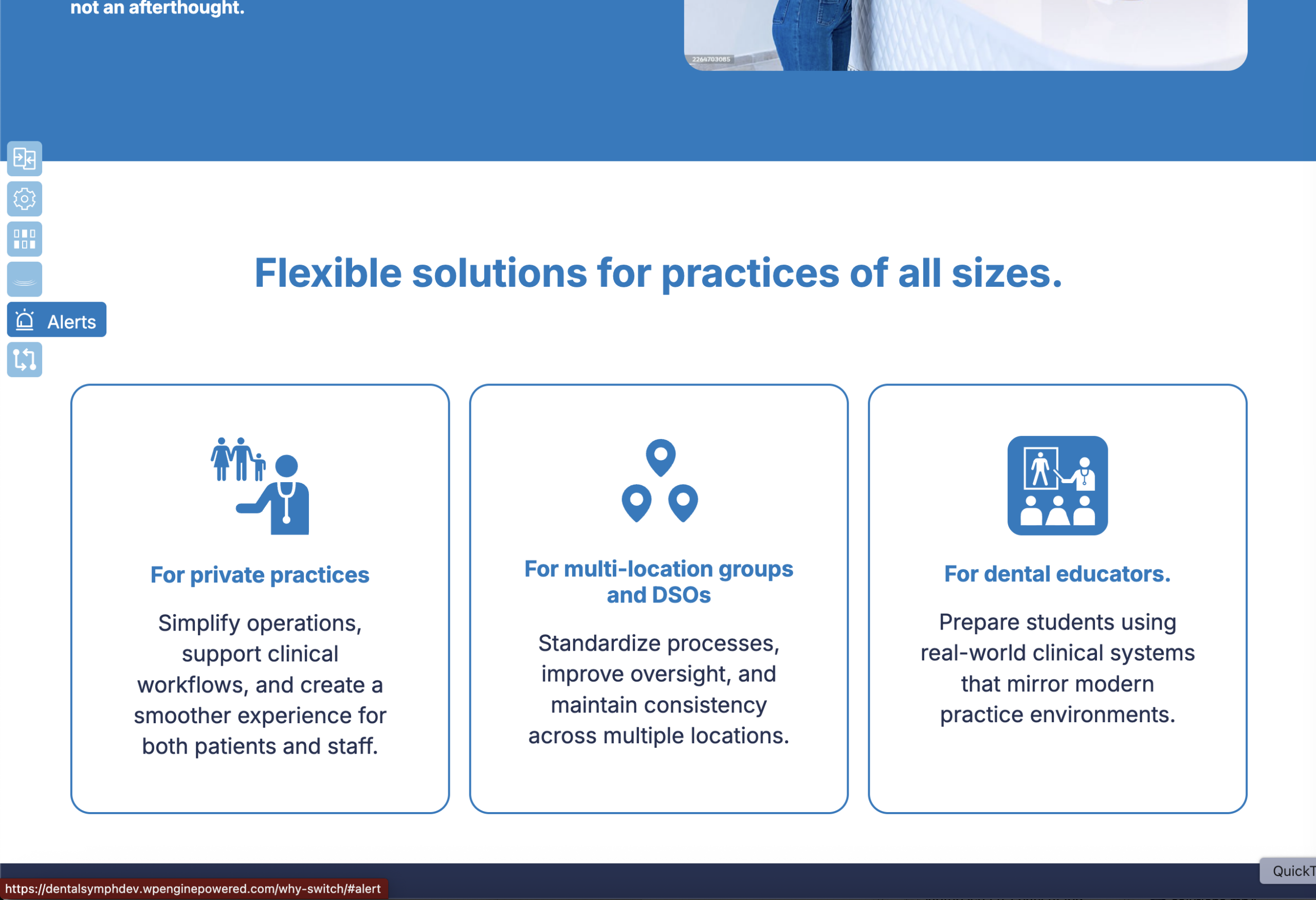
For pages containing multiple product concepts, I implemented a persistent side navigation that allows visitors to jump directly to the information most relevant to them.
The navigation was intentionally designed to resemble menu patterns within the Dental Symphony software.
This creates continuity between the marketing experience and the application itself, introducing visitors to elements of the product’s visual language before they ever schedule a demonstration.
Conversion-Focused User Journeys
The site is structured around a clear destination:
Schedule a Demo.
Calls to action are incorporated throughout the experience rather than relying on a single conversion point at the end of the journey.
Whether a visitor explores a complete page or only the sections relevant to their needs, a path toward the next step remains readily available.
Technical Implementation
The website was developed in WordPress using a custom Gutenberg block system and the WordPress API, creating a modular architecture that supports both the visual design and future content management.
Development included:
Custom Gutenberg block development
WordPress API integration
Modular, reusable page components
Responsive layouts across desktop, tablet, and mobile
Interactive side navigation for long-form pages
Animated SVG implementation
Responsive media and typography
Reusable color-coded content systems
Conversion-focused CTA components
Cross-device interaction and layout behavior
Because the site’s visual storytelling depends heavily on custom layouts, interactions, and animations, responsiveness was considered at the component level rather than treated as a final adaptation of the desktop experience.
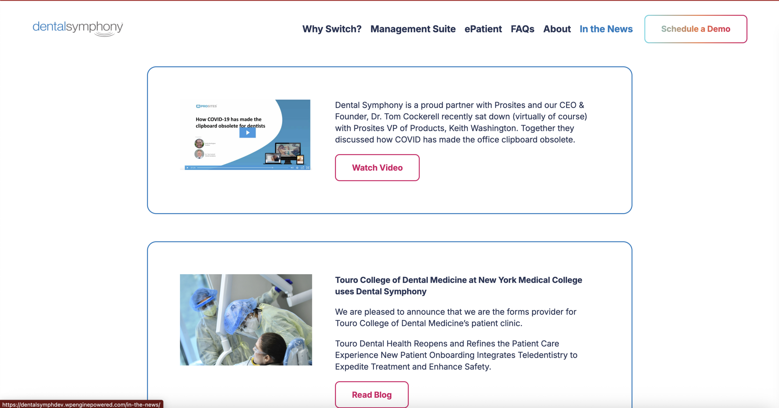
Testimonial photography presented another challenge. Several supplied images were too low-resolution for prominent use within the new layouts. AI-assisted image enhancement was used to improve the available assets, allowing the authentic customer photography to be retained while providing sufficient visual quality for modern high-resolution displays.
Outcome
The finished website transforms a large amount of technical product information into a structured, approachable sales experience.
Reducing the copy, introducing clear visual segmentation, and providing section-level navigation allows visitors to understand the product without having to process every detail at once.
At the same time, visual references to the Dental Symphony application establish continuity between the marketing site and the software itself, while animation and branded motifs prevent the information-heavy experience from feeling static.
Most importantly, the architecture keeps the business objective visible throughout the experience: moving interested visitors from understanding the product → identifying relevant features → scheduling a demo.
The result is a responsive WordPress platform that combines UX strategy, content strategy, visual design, custom development, and conversion thinking to make a complex software offering easier to understand and easier to act on.