
Artist site – immersive, promotional driven


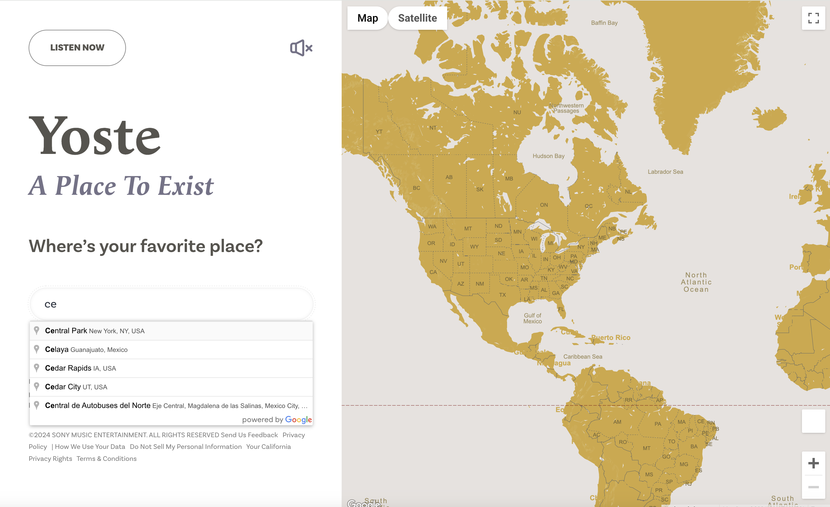
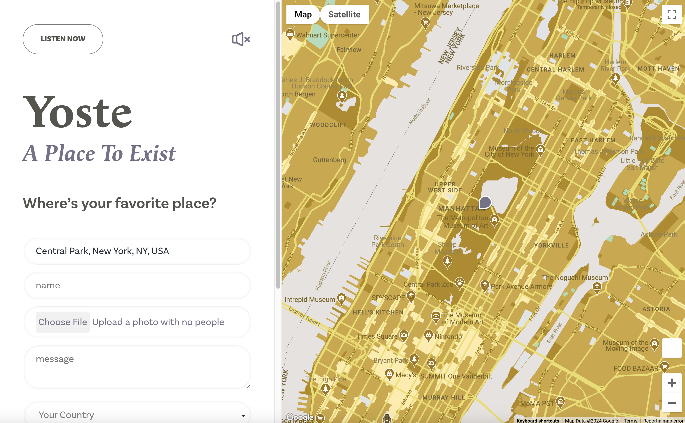
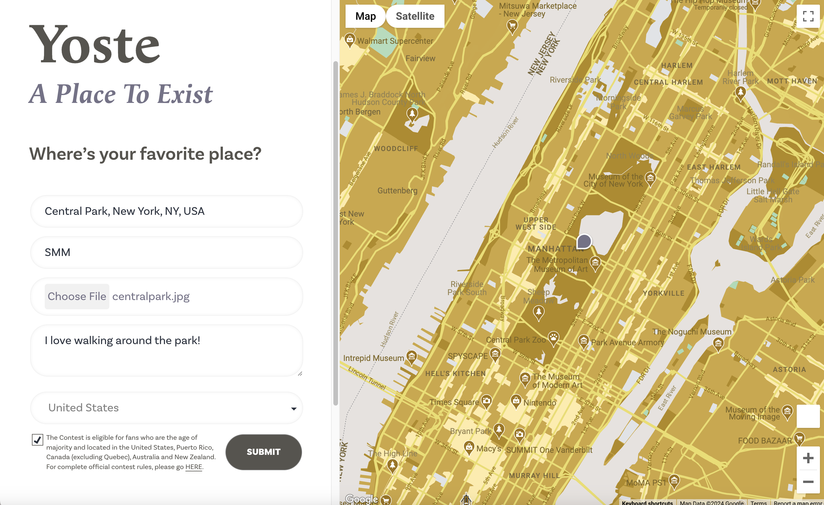
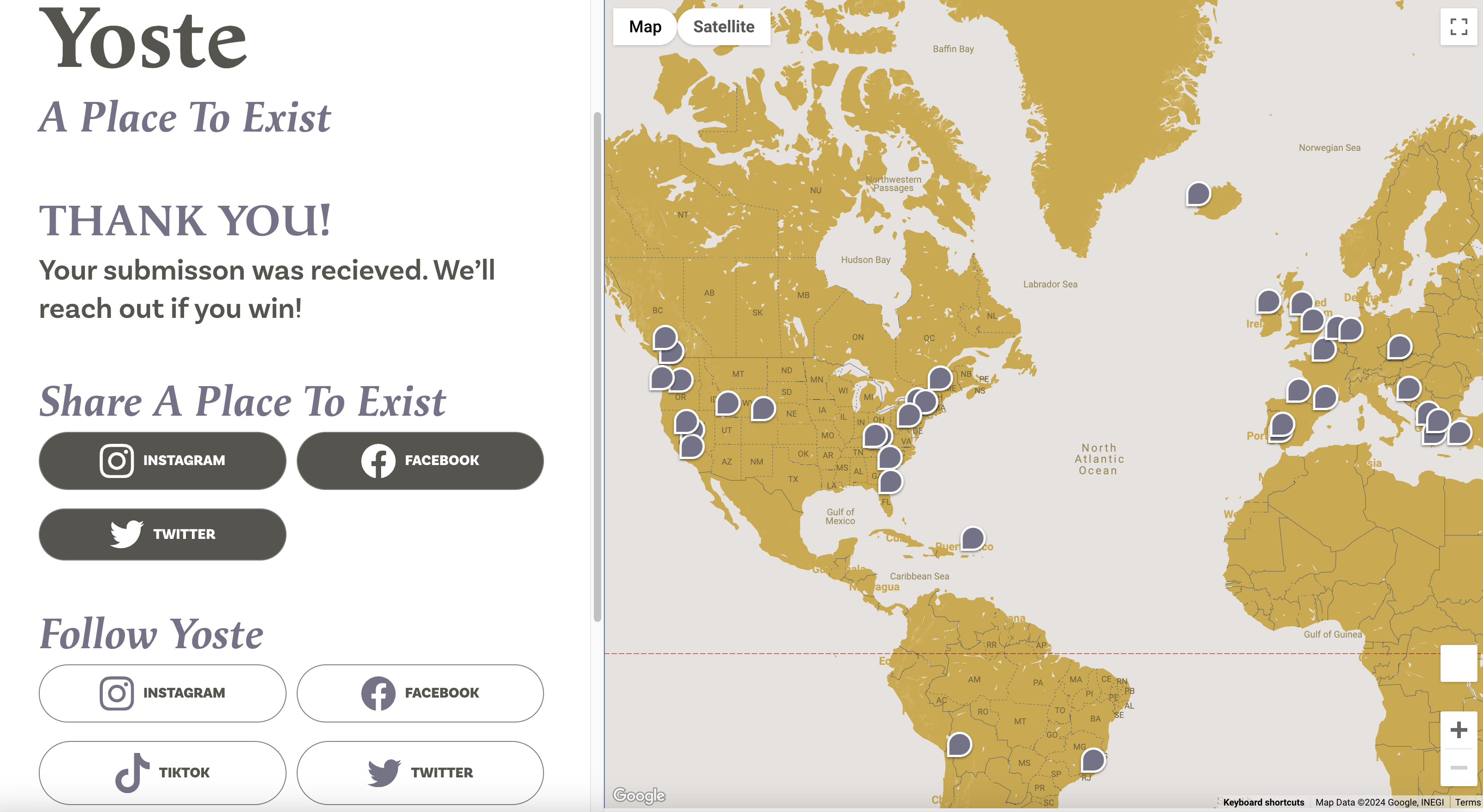
Abstract
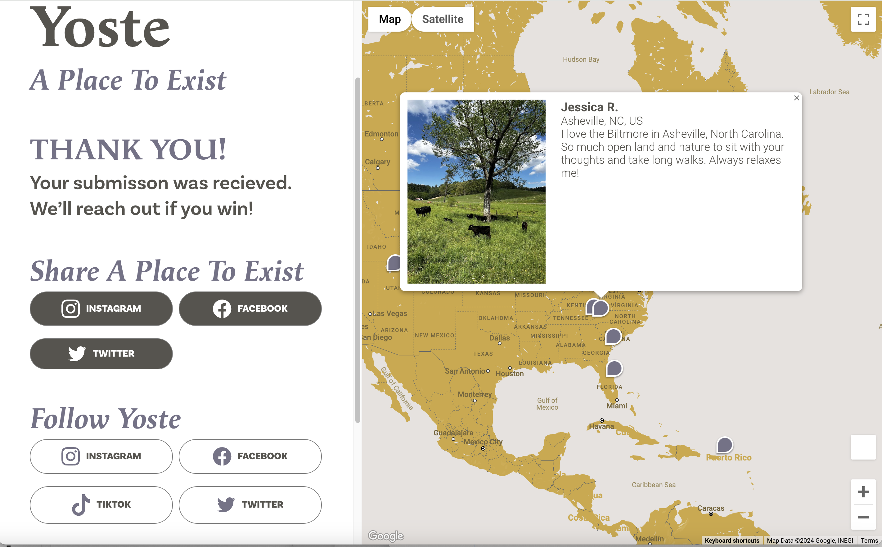
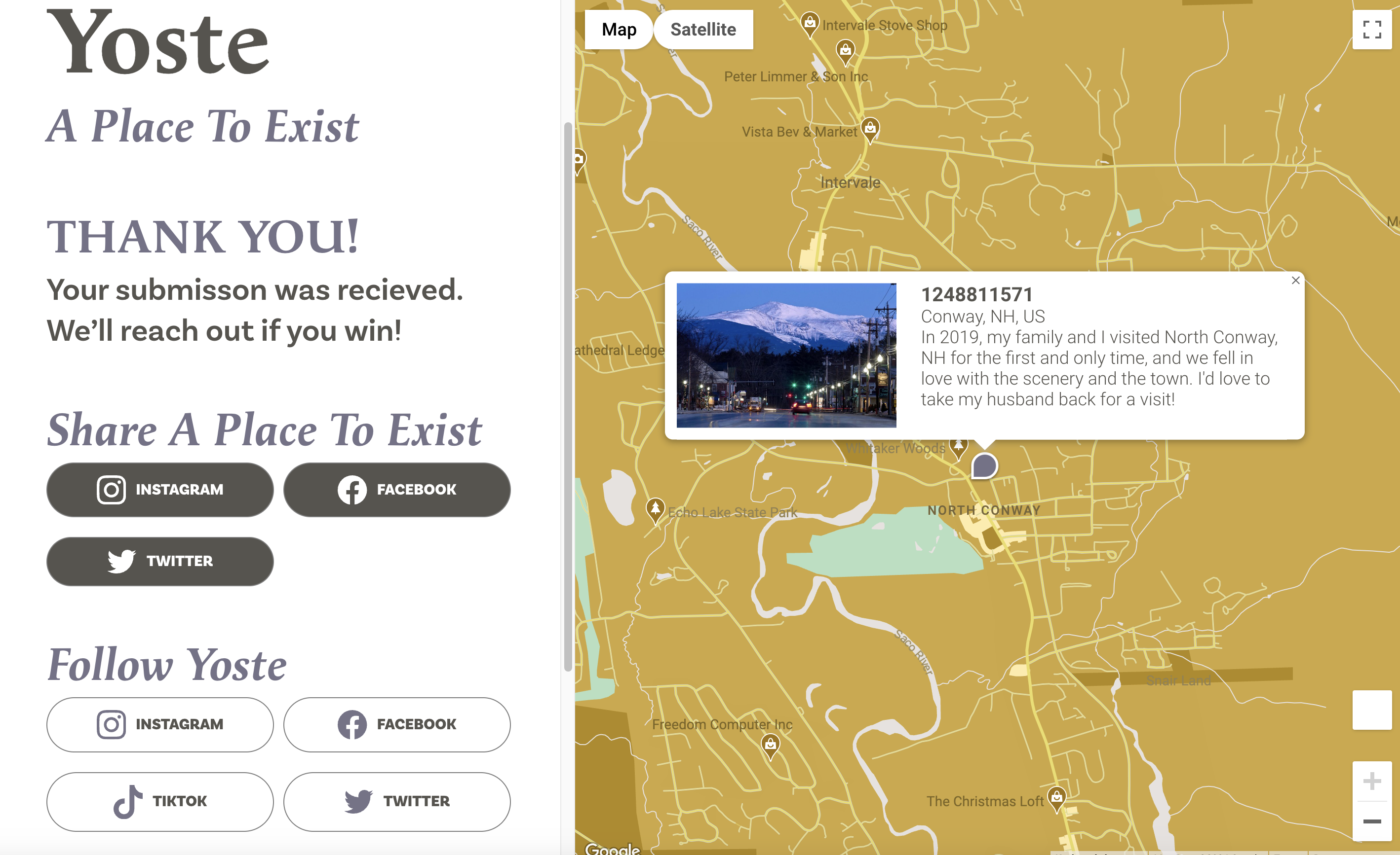
This project explores the design and development of a responsive promotional website for the artist Yoste to support the release of A Place to Exist. Rather than relying on conventional music promotion formats, the site was conceived as an immersive digital environment that reflects the emotional tone of the album. Drawing inspiration from diary entries and scrapbook compositions, the experience prioritizes mood, narrative, and exploration while maintaining performance and usability across devices.
Problem
Most music promotional websites follow a predictable structure: static layouts, embedded media, and direct links to streaming platforms. While effective for distribution, these formats rarely communicate the emotional identity of an album or create a meaningful connection with the audience.
For A Place to Exist, a traditional promotional site would not adequately represent the introspective and atmospheric nature of the music. The challenge was to create a digital experience that could:
- convey emotional depth rather than just information
- encourage exploration instead of passive consumption
- function across devices without losing its artistic identity
Design Goals
Create an experience that feels personal and introspective, similar to reading a private journal or exploring a collection of memories.
Allow users to discover content organically rather than forcing a rigid navigation structure.
Ensure that the experience translates effectively across desktop and mobile without collapsing into a generic layout.
Concept Development
The core concept was to design the site as a digital scrapbook / diary hybrid.
This direction was chosen to reflect:
- the emotional tone of the album
- themes of memory, identity, and introspection
- a sense of fragmentation rather than polished presentation
Visually, this translated into:
- layered compositions
- an intentionally imperfect layout
- mixed media elements (imagery, text, textures)
The goal was to avoid the rigidity of traditional grid systems and instead create a composition that feels assembled rather than engineered.
Experience Design
Instead of a conventional navigation system, the site is structured as a progressive scroll-based experience.
Key decisions:
- Content is revealed gradually, mimicking the act of flipping through pages
- Sections are visually distinct but connected through flow and rhythm
- Navigation is minimized to preserve immersion
This approach shifts the user’s role from “viewer” to “explorer.”
Technical Implementation
WordPress with custom Gutenberg blocks and Advanced Custom Fields (ACF) for structured content management.
Desktop layouts emphasize layered compositions. Mobile layouts reinterpret these layers into a vertical flow.
Image assets optimized for web delivery and decorative elements balanced against load performance.
Outcome
The final result is a promotional experience that functions as both a website and a narrative artifact. Rather than acting solely as a distribution tool, the site creates an environment where users can engage with the tone and identity of the album.
The project demonstrates how digital design can move beyond standard promotional patterns to create experiences that are:
- emotionally resonant
- visually distinctive
- technically adaptable